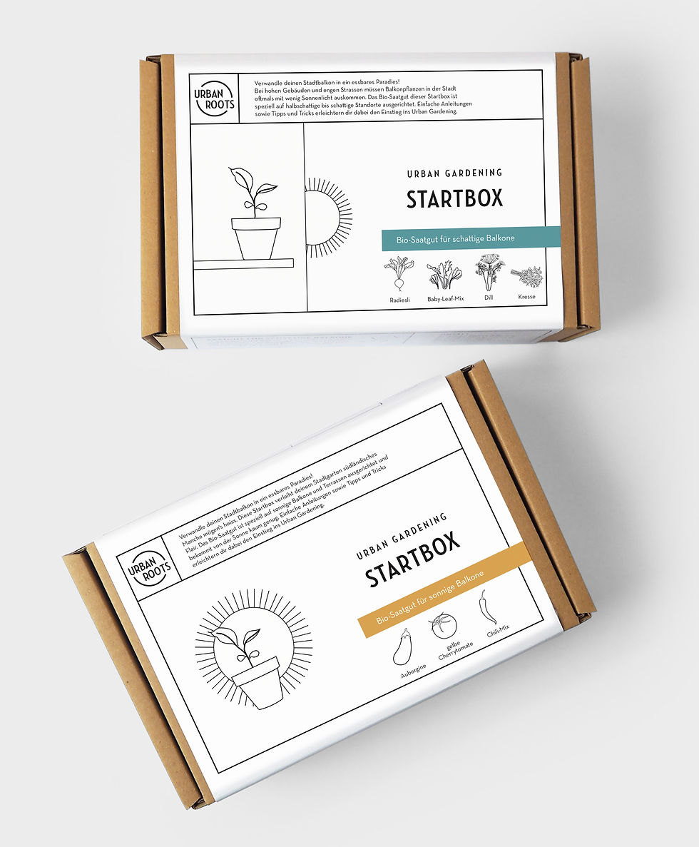
New Packaging Design for urbanroots
- Scarlet Allen
- 6. Apr. 2019
- 1 Min. Lesezeit
Aktualisiert: 18. Juli 2020
I didn't expect packaging design to be so difficult. Most packaging designs are really ugly and I thought it would be easy to make it look better than most of these. But I was wrong. It seams that packaging design follows completely different rules than graphic design. It's super normal to use several different fonts and font sizes, mix colors and repeat the same information over and over again.
I took a field trip to the super market and analysed the packagings I found appealing and realised that they are all quite ugly when you look at it closely.
In the end I found a language to stay true to my CI, but still make the product look like it could be found in a store shelf.
By the way: The hole packaging and all the products inside are completely compostable. All parts are locally produced and assembled by hand.


Kommentare